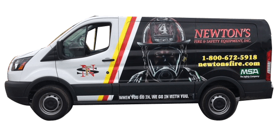
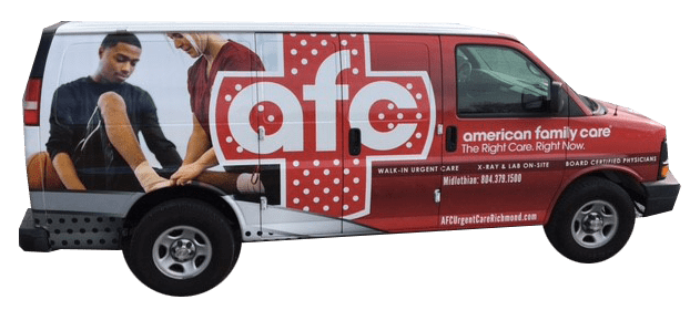
Vehicle Wrap Designs use visual hierarchy which is the placement of design elements by importance based on how the human eye takes in visual content. Graphic design hierarchy is critical sense it’s moving down the highway at 55 MPH!
Vehicle Wraps – Graphic Design Elements Message
Before setting Vehicle Wrap Designs hierarchy in order, your organization must consider what messages take precedence, what is the hierarchy of your messages? What do you want to communicate and what do you want people to understand about your business. Consider the following and create a hierarchy from this list.
- Logo
- Branding
- Products and Services
- Tag Lines and Message
- Contact Information
Vehicle Wraps – Graphic Design Elements
The critical elements of graphic design are also the key elements of vehicle graphic design hierarchy. The difference again is that the elements are even more important on a moving vehicle. While a stationary design such as a sign might be able to get away with design elements that don’t stand out, a vehicle wrap can’t. It needs strong and clear design elements to be effective.
- Size
- Color
- Contrast
- Whitespace
- Placement

Other elements to consider in the designs for Vehicle Wraps – Graphic Design Elements:
Focal point: What point on the vehicle captures the most attention?
Balance: It’s easy to go overboard and design one element that overpowers all the others and vice versa. The design needs to be balanced and pleasing to the eye.
Rule of thirds: The rule of thirds is used in photography as well as video creation. The rule of thirds is dividing a screen into thirds and then placing the primary element in one-third of the graph. This method draws the human eye into the composition rather than glancing at the entire graphic.
Contact us today and let us help bring your design to life!